Showing posts with label Dining Rooms. Show all posts

Friday, January 6, 2017

New Traditional

What better way to get inspired for the new year than by a new project designed by Studio McGee? This is (by far) my favorite project they've showcased.  I like to call it the 'new traditional'.  


In a square room like this one, a round table is a smart design choice.  Helps make the room easy to navigate.  


Mixing in modern elements, like this lamp, helps keep the room feeling young and fresh.   Like the lamp, but not the price tag?  

Here is a similar one half the cost.  


The dining room is a show stopper, no?  The Hollyhock wallpaper!  I'm in love.   The mix of the light wood furnishings with the dark wood stained floors helps keep the room feeling fresh and airy.  

Like floor color?  Mix one half Ebony and one half Jacobean from Minwax to achieve a similar wood stain.


Such good flow. 


If you are like me and love everything about the look of this project, don't hesitate to contact me and I'll help you create this look for your home!!  And, if you love the dining room wallpaper, it was meant to be, because we are then soul sisters! ;)

Thursday, November 10, 2016

Making Room for a Crowd - My Thanksgiving Table


Happy November!  Recently, StyleBlueprint Louisville contacted me for some tips on successful holiday entertaining.  I thought what a great opportunity, as I recently had to dust off a folding table stored in our attic a couple of weekends ago, when we invited a few friends over very last minute for an impromptu dinner.

Aren't we all having to do the same thing?  Trying to accommodate a large number of guests or even last minute company during the holidays??

Below I share how to entertain for a crowd 'stylishly' this season using a folding table and mismatched chairs!  Hop over to StyleBlueprint Louisville to read more about this here.


To hide my ugly folding table I bought two yards of burlap fabric for under $10 from Joann's to act as the tablecloth and then layered my monogrammed linen hemstitch runner I already owned on top of it.  I almost always use chargers when it comes to setting my holiday tables (instead of placemats) as they always make for easy clean-up.  Besides, it mixes up your china which lightens the mood.


Another no-fail tip is to always use greenery as your centerpiece.  Here, I bought a couple of bunches of seeded eucalyptus from Trader Joe's for $3/bunch and combined it with a dozen of coral colored spray roses from Kroger.  The resin antlers holiday ornaments, I picked up from Digs Home and Garden for $15, make for a nice addition to my centerpiece.  I also picked up some fallen magnolia leaves (with sprigs of winterberries) from my backyard and used them as an embellishment on each of the guest's plates.


Lots of layers and texture!


Don't worry about mixing your chairs during the holidays.  Here I used my upholstered parson chairs (from Ikea) as the host and hostess chairs and then used my bamboo kitchen chairs for the rest of the seating around the table.  


Lighting is so important when decorating your table and setting the mood.  Candles and table lamps (instead of recessed canned lighting) make your home feel cozy and look more festive.  Use pillar, tapered and tea light candles.  Any vessel will work!  I love the look of mercury glass or iridescent votive candle holders when decorating for the holidays.  


I hope you enjoyed my thanksgiving table and tips on entertaining! Thank you to Styleblueprint Louisville for sharing my ideas!

SaveSave

Thursday, September 29, 2016

A Dining Room Refresh

I recently completed a design for a client's dining room who I have been very lucky to work with for a while now!  She wanted to update her dining room and wasn't sure where to start. We initially talked about just changing the paint color and well, one thing led to the next, and you know how that goes! :)


Here is a breakdown of how her space will get a new look:

1) The things that couldn't change were the aqua colored window treatments and her mahogany chippendale dining room set.  To start, I wanted to break-up the all the brown in the furniture and so my client boldly agreed to PAINT her dining room chairs a creamy off-white!  The dining room table and chairs pictured above in the design board are actually hers (after she painted the chairs)!!

2) My clients LOVES audubon artwork.  I suggested a large framed audubon print over her buffet table.  It's the perfect spot for something dramatic because you immediately see it in when you enter through the front door.  The audubon's colors are fantastic and determined the rest of the color palette for the space.  Below is a more detailed shot of what I was envisioning....


3) We decided to go bold and paint the walls a beautiful blue green teal.  

4) She also has a beautiful hutch I suggested that she re-paint in a chalky, plaster like off-white color with distressed edges.  The hutch will be flanked with two Ballard Designs Louis chairs upholstered in green velvet with some contrasting welt.  

5) I suggested the Brunschswig and Fils Les Touches fabric for the pillows on her Louis chairs and a warm peacock hue check for the seats of her dining room chairs.  

6) Lastly, we will be accessorizing with a lot of blue and white accessories and bamboo accents as a nod to the hollywood regency look!  


Monday, March 14, 2016

Mixing It Up

It's funny how certain things that you are currently loving can be randomly thrown together and work quite effortlessly in a room.  Kinda like a blender drink, no?  Throw all the things you love in a blender and bam, you got one fabulous smoothie or a great frozen cocktail!

I realize that isn't always the case and editing is involved, but I was playing around with things I am currently loving lately and this is what I came up with.


Paint: Happy St. Patrick's Day! Loving emerald green lately probably because I used a darker hue in a client's living room, but I want to use this color more.  So classic.  I would love to paint a den or study in this rich, classic color.  It has me questioning my own LR and DR color schemes! Ugh!

Drapes: I've been a long-time lover of Brunschwig & Fils classic print, Les Touches and would love to use it in a project.  It's SO classic but fresh at the same time.  I can see them in a dining room as drapes - they would make such an impact.  And, if, that isn't in your budget, buy a yard or two for your chairs or as a tablecloth!

Rug: I guess I've been hiding under a rock, but just recently found out that Fibreworks is based in Louisville.  I recently met with a representative to get some of their Bakari samples.   Love this oversized graphic diamond pattern and it would look super chic in a dining or living room.  It keeps the room from feeling too formal or stuffy.

Pillow: Another fabric I'm just dying (DYING) to use and I might need to get it for my own home.  Brunshwig & Fils Chevron Bar silk warp print.  They have a beautiful blue colorway too!

Tortoise:  I NEED more tortoise in my home.  I realized I don't own a single piece.  What is wrong with me?

Lamps:  While I love me a beautiful gourd, these super chic lamps are so gorgeous, no?  They have a beautiful crackle finish.

Lastly, I apologize for the absence from this blog and IG.  Both my kiddos got hit with the flu these past two weeks and when that happens you go into survival mode.  Thankfully, we have a healthy family again and this will be our first week back to school!

Tuesday, November 17, 2015

Thank you and A Beautiful (Renovated) Cottage

I just want to say 'THANK YOU' for stopping by to see my One Room Challenge and leaving such incredible comments!! I felt the love you guys - thank you so much!!  It truly was icing on the cake after having worked so hard on it and not knowing how it would be received.  I would be lying if I didn't say that I had a nervous stomach for most of the day!

Today, I thought I'd leave you with some pretty pictures found on StyleBlueprint of this beautifully renovated cottage designed by Julie Couch.

This home is a great testimony on how to maximize the most of your natural light when you have a small home!  I'll let the pictures by Alyssa Rosenheck Photography speak for themselves.


To see more of this beautiful home designed by Julie Couch, go here.  Have a good week!

Monday, September 21, 2015

A New Take on a Family's Napa Home

Back in 2014, Style Me Pretty, posted a beautiful home tour designed by Irene Lovett from Designstiles.  You can see the full home tour here.  But, fast forward to today and it seems like the same home got some pretty fantastic updates.

Both Rue Magazine and Domaine have published the same home tour (with the new updates) and I thought it would be fun to note the differences.

This is the family's dining room shown in 2014 on Style Me Pretty.


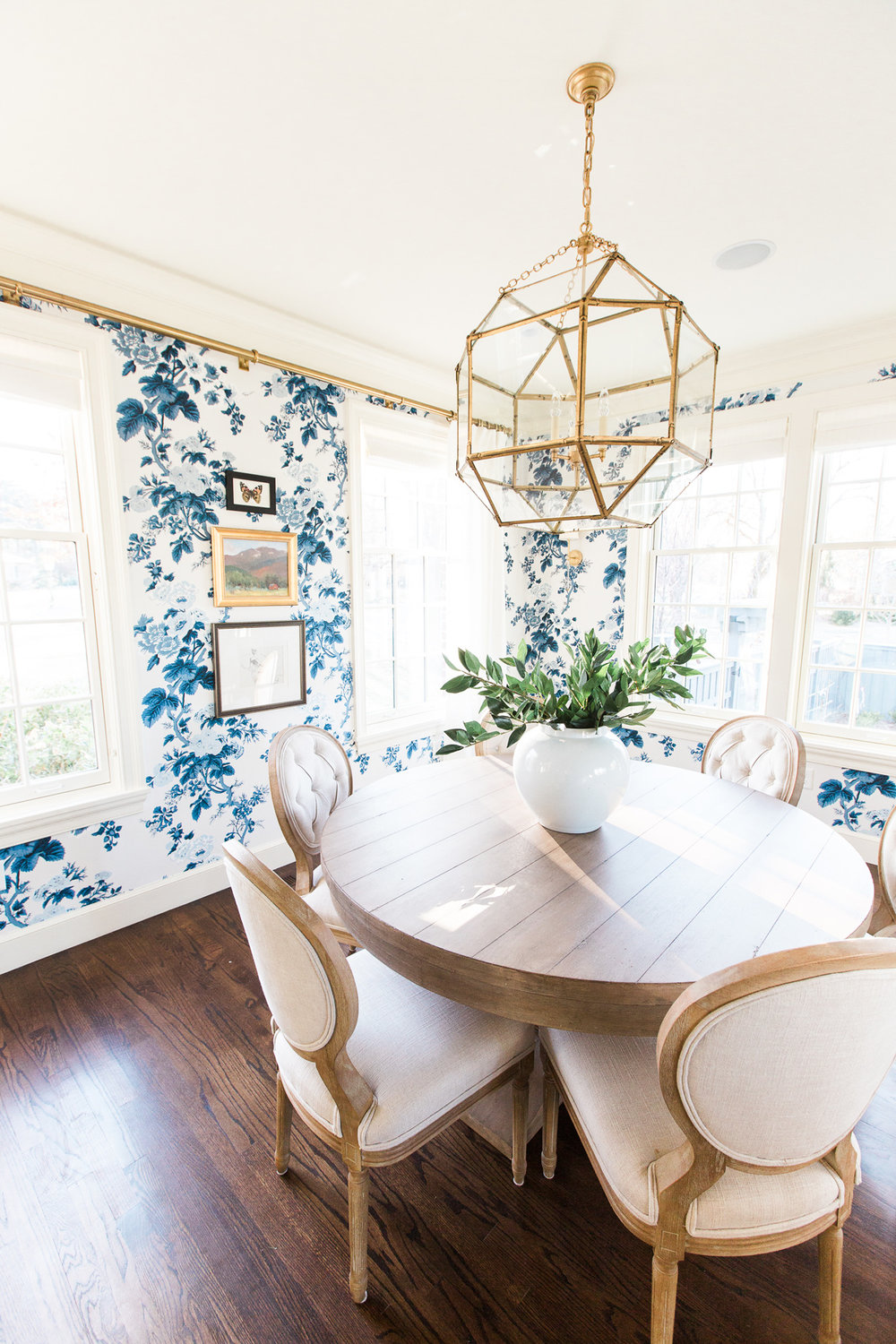
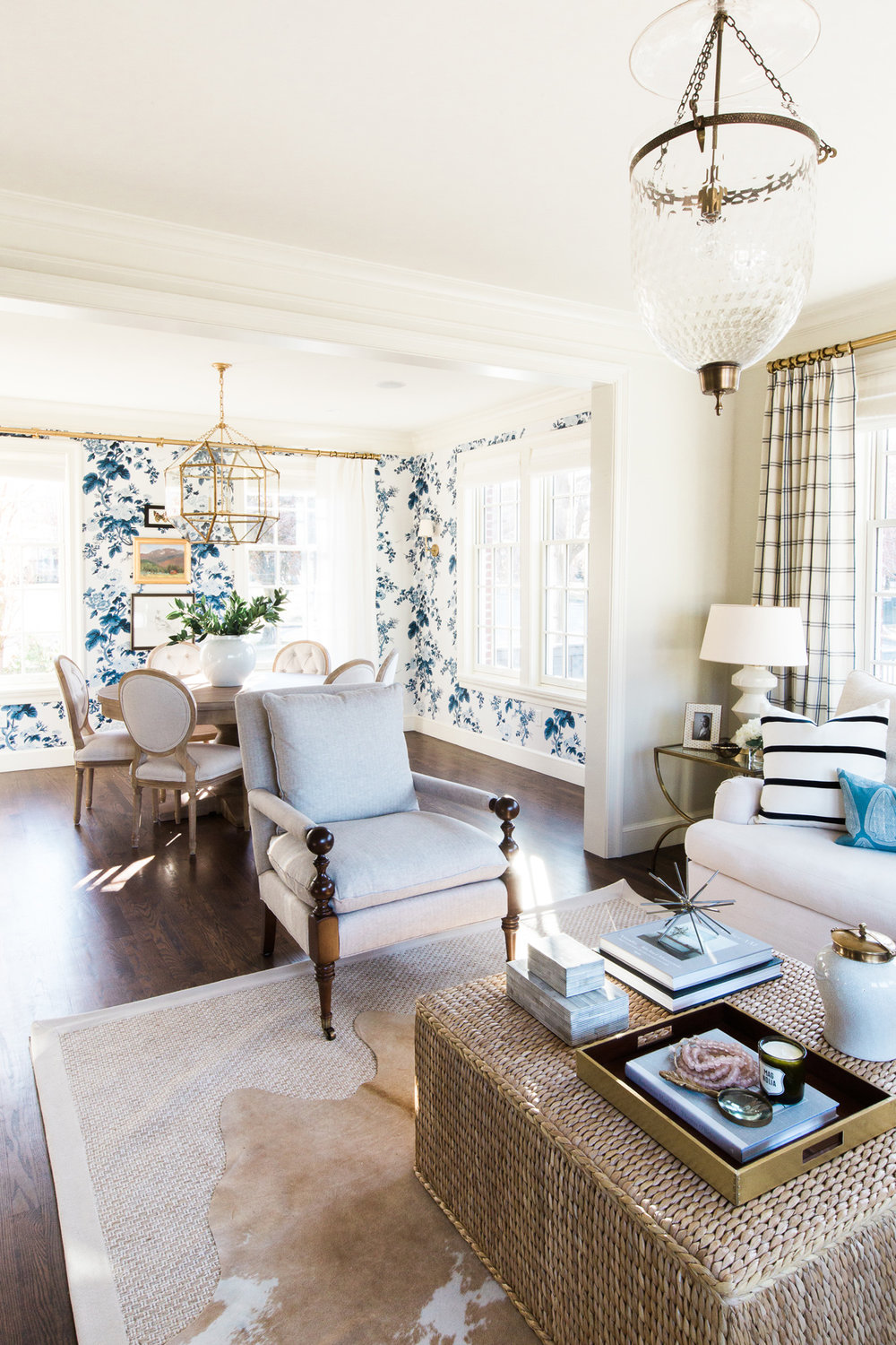
I love the antique rug and how clean and fresh this room looks.  And, below is the dining room as seen now on Domaine.


It is always interesting to note what has remained or changed.  I love the softer palette.  Just beautiful.  They obviously kept the furniture, but installed wall to wall carpeting, layered with a new antique rug.  They also installed a new light fixture and changed out the mirror.  It seems like the 'old' dining room mirror got relocated to the bathroom.  See below.


Looks wonderful here!  Another room that received an update is the powder room pictured below (this picture was shown on Style Me Pretty).


This room is so different now.  Here it is (below) now on Domaine.


Can we just say brilliant!!  In my opinion, the paneling and grasscloth make this powder room (and the floor tiles aren't bad either) ;) I love how they used the Serena and Lily's mirror (which I would love to use either in my own home or in someone else's home.)

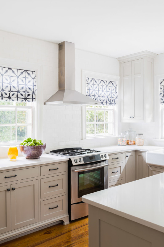
Here is a picture of the home's kitchen on Style Me Pretty back in 2014.


It appears that the kitchen got a pretty significant renovation.  There isn't a window anymore above the stove, the fridge got relocated, they installed brass hardware, changed out the island pendants and installed a new island.  Here is the kitchen now on Domaine.


They relocated the Hicks pendant to the kitchen nook and I love, love the blue island.  So, which do you like better?  Anything you see that you absolutely love?  To see more of this Irene Lovett's portfolio, go here.  You won't be disappointed!

Thursday, June 4, 2015

A Martha Vineyard's Home

There are so many elements I love about this home.  The nautical touches, the subdued, but fun use of color and pattern and all the classical elements running throughout the home.  


I love how colonial this dining room feels.  The above room was the inspiration for my dining room; see our dining room progress here.  


Is that Katie Ridder's Peony pattern in a rug? (above).  I've never seen it as a rug before.  


This home has all my favorites - striped walls, painted floors, spindles, empire lamp shades, gold framed nautical oil paintings, Katie Ridder fabrics, blue and green colors, antique furnishings and colonial touches.  To see more of this home designed by Molly Luetkemeyer (m. design interiors), go here.  

Wednesday, May 27, 2015

Our Dining Room: Paint Progress

Life has been hurdling by at breakneck speed (is May almost over….seriously?) and there has been much going on in our household.  School just got out and we're gearing up for summer.  This means lots of outdoor activities and projects.  BUT, we're still trying to tie up some loose ends with some of our indoor spring projects.  Specifically, we're trying to finish up our dining room.  I'm very excited to tell you that our dining room is almost fully painted.

Remember, this post where I was undecided with painting just the trim OR painting the trim and below the chair rail?  Well, the decision has been made….


{in progress: window mullions still need to still be painted}

I'm in love.  Seriously.  I originally just wanted the molding/trim painted blue, but after living with it for  a week or two, the space didn't feel grounded enough.  It felt to ethereal and I decided I needed more color.


{in progress}

So my very patient husband granted my wish and painted below the chair rail this past memorial day weekend and I love how it turned out.  


The above fabric will be for the floor length lined window panels.  I will be doing black hardware so it ties in with the black lantern.  I still need to decide if I want to have a woven shade layered behind the panels and what type of pleat for the panels. 


Here you can see the various types of pleats my seamstress does and I want the french triple pleat (top row…third from the left).


Above is the fabric scheme I am considering for the DR.  The ticking and check will be used as slips on the chairs and the les indiennes floral will be used as two pillows on the head chairs flanking the cupboard.

So, we're slowly getting there.  There is still a ton to be done and I will save the other details like the furniture and slipcovered parson chairs for a later post (when I have some pics)!!!  Hope you enjoyed!!

Tuesday, March 17, 2015

Our Dining Room: Progress

Happy St. Patrick's Day!  Well, this has nothing to do with St. Patricks day and all to do about my dining room!  Ha!  Anyway, I'm trying my hardest to make progress on some rooms in our home before May arrives (translation: lots of family and friends visiting).

Here is one combination I am considering for our dining room (the fabric is for the drapes).


At first, I was ho-hum about the fabric, but my husband really likes it and lately, it is really growing on me.  I like how the navy and red keeps the color scheme grounded.

When picking out the paint colors for the DR walls, my sticking point was this cabinet/bookcase below which I plan on using it in our DR.  I wanted one of the paint colors to match it so it looks cohesive.  It took a lot of paint samples, but I got it.


I always feel that if you have one painted piece of furniture in a room it adds some whimsy and casualness which I really admire.  I did that for my daughter's room and really liked how it turned out.

The plan is for the lantern to hang over an antique dining table (have yet to purchase).   But, something along the lines of this…


I am considering two ideas for our DR when it comes to painting our walls.

Idea #1: Is to paint the all the walls ivory and to paint the trim the blue greenish grayish color.  Remember that the cabinet will also be the blueish greenish grayish color too.  Here is some inspiration:


Idea #2: Since my DR has a chair rail, another option is to paint the chair rail and the wall below the chair rail the blueish greenish color along with all the trim and keep the ivory above the chair rail.  See inspiration…


What is your preference?  Honestly, I like both styles so I think I am going to try both and see what I like better.  I'll be honest though, I am so nervous to paint the trim!!  Have you ever painted your trim a different color than white??