Thursday, May 31, 2012

Woven Shade Placement

A while back I came across a very interesting article that talked about where you should hang your woven/bamboo shades when you have drapes.  I was a little surprised by this author's (adamant) view that there should never be 'dead space' between the curtain rod and the woven shade.

Ashley Putman in Lonny

You see the 'red' arrow above?  This is considered "dead space".  And, instead, the author was arguing that the top of the woven shade should be flush with the curtain rod in order to eliminate any dead space.  See below.

Markham Roberts in House Beautiful

I am embarassed to say that I have never noticed this before.  So I began looking around at images (with different lighting, ceiling height, window sizes, etc.) to figure out if I had a preference.  And after all that looking ... it's pretty much a toss-up (maybe 60/40 in favor of leaving the dead space).  I like seeing the molding around the top of the window.  And there isn't a sudden change in the amount of light passing through the shade as your eye looks above the window.  

But there doesn't appear to be uniformity out there.  For example, here are some rooms by Ashley Whittaker that feature woven shades that are flushed up with the top of the drapes.  


Here, Celerie Kemble has the shades flushed up with the drapes as well.  


By contrast, here are a few rooms by Amanda Nisbet, Steven Gambrel and Sara Gilbane that feature woven shades with the dead space visible.  


So there's clearly not one accepted way to proceed.  But it does beg the question, "is there a clear benefit to one technique vs. the other?"  At first glance, I can't see a clear practical reason favoring one method, e.g., one is much easier to mount (am I missing something?).  And so this seems to come down to aesthetics.  But either way, this is just one more example of the dozens upon dozens of little details that impact the overall vibe of a room.  

Tuesday, May 29, 2012

Designer Lovin': Brittany Stiles

I recently found a new (to me) designer via pinterest whose style really impressed me.  Her name is Brittany Stiles and she is a California based interior designer.  She "appreciates all types of design - from traditional to modern; and cottage chic to asian inspired."  She is very comfortable with mixing traditional and modern furnishings with vintage and antique treasures as evidenced below...


In addition to her design business, she also has a very inspiring blog.  I appreciate it when successful designers explain their thought process behind their design decisions.  Some of my favorite posts are...

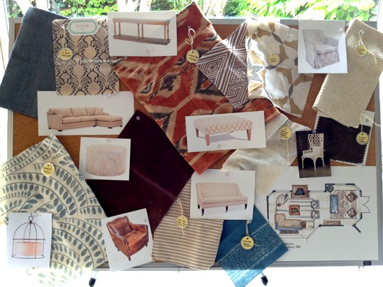
Her Presentation Board

Her design process with her clients.  She takes you through her design process step by step from the initial meeting to her beautiful color renderings.  I found it very interesting and informative.  

A newly upholstered vintage sofa

Her on-going design projects.  In this post, she bought a vintage sofa for her apartment where she infused her own design modifications and goes into detail of what she changed to make the sofa better.  


Detailed posts on the furnishing of her apartment.  We're in luck because this Friday, June 1st, she is having a Tastemaker Tag Sale on One Kings Lane featuring her living and dining room furnishings!  


I look forward to seeing the sale as well as following her in the future!  To say I was completely inspired is an understatement!!  

Friday, May 25, 2012

My week in pictures...


E can finally wear her Mabo outfit.  It was the first outfit I bought when I found out she was a girl!


Beautiful blue and white china


Antique brick


My view of Vienna from the Belvedere.  I got to see a lot of Gustav Klimt's work and when I saw the 'Kiss' in person it brought tears to my eyes. So incredibly beautiful.


Beautiful ironwork


A cup of coffee at my favorite cafe.  Don't you love the heart?  

Well, I wish you all a great weekend!  It's a holiday weekend here and we plan on visiting Baden to see the Festival of Roses.  I can't wait!


Wednesday, May 23, 2012

Dreaming

I had fun putting together a mood board for a dining room.  I designed it with some elements that I am currently loving at the moment.   


{1, 2, 3, 4, 5}

Contrast.  I've been so drawn to rooms lately with lots of contrast.  To create more contrast, I'd paint the back of the bookshelves a dark color.  

Floor to Ceiling bookcases.  I would flank an entire wall with built-in bookcases.

Rustic.  I'm loving rustic dining tables.  

Unexpected.  The gold shell chandelier, the mix of french chairs with the rustic table create a bit of the unexpected for me.
  

So, are you feeling it?  What elements do you like?

Monday, May 21, 2012

Casual Vibe

Do you ever go through a phase where you've got a particular design style stuck in your head and you can't think of anything else?  Currently, I'm stuck on dining rooms with a casual vibe.


You're going to notice a theme with all these photos.  There usually is a reclaimed wooden dining table that provides the rustic charm paired with either modern chairs or light fixtures which gives the room an edge.


The color palette is restricted and interest is added by textures of materials.  Contrast is the name of the game in the above photo.


Don't you just feel like you can breathe in this room?  Of course, it helps to have very tall ceilings and loads of natural light. ;)


I love the drum pendants and I think the striped rug really makes this whole space so comfortable and casual.  

All images here

I like the mix of dark grasscloth wallpaper and white moldings.  So classic.  

I think this casual look is great for a dining room when you don't have an eat in kitchen.  The rustic table allows for daily usage and wear-n-tear.  

And, if your family is anything like mine it quickly turns into the art room or the game room.  Hmm....definitely something to consider especially when you have children!


Sunday, May 20, 2012

Gruss Gott!

We got back this week from a visit to my mother's hometown of Trier, Germany.  It had been a little over four years (Luke was 7 months) since we last visited my mother's family.  As a kid, we frequently visited Trier and I have very fond memories of my mother's hometown and her family.

It was such a treat and I was so excited for them to see Luke, now 5 years old, and for them to finally meet Elizabeth.


We stayed in an adorable two bedroom apartment with all the traditional German furnishings.

Before we did anything, I promised Luke we could head to one of my favorite ice cream cafes in Trier and have spaghetti eis (an ice cream sundae that looks like spaghetti).  When we were children, we always came here to have spaghetti eis.


Seeing the spaghetti eis being made was almost as fun as eating it!


Our entire visit was spent visiting family and just having a great time catching up.  There are too many photos to share.  Here are just a couple.  

My Mom's sisters couldn't get enough of the kids!


Here we are on Mother's Day at the playground before going out to a Mother's day lunch.  My stylish cousin, Claudia, playing a game with Luke.


Later that day, we had dinner at my cousin Soraya's home.  A beautiful and delicious feast was served.    


It was a great visit.  You know the one that you don't want to end, but traveling with two small children is no small task.  We came home to a heap full of laundry and sick children.  On top of that I guess I didn't realize that there was a holiday this week in Austria so Luke had no school.  It was a long week, hence the absence here at Green Street.  

Hope you all had a wonderful week and Mother's Day!


Thursday, May 10, 2012

Wishing....


Mother Teresa by Sunita Kumar

a Happy Mother's Day to all you mothers and mothers to be.  We will be traveling this Mother's Day to visit my own mother's family in Trier, Germany.  It will be very special.  See you next week!

Tuesday, May 8, 2012

A Small Den

I have a great friend who is moving to Rockville, MD this summer.  They just bought a house and we've been consulting on paint colors, furniture, flooring, fabric, etc.!  She is a mom of 4 children (ages ranging from a 4 month old to a 6 year old) and while she would love to dedicate more time on decorating her home, she just doesn't have the time.  This is where I come in!!

We're working on her family room and I saw this oldie, but goodie from Anne Turner Carroll, which was published in Southern Living, and I think it is a great example of how to make a small space work.

This is what she started with...

After working her magic, this is what she ended up with.....


Beautiful, no?

This room was challenging in that all three walls had either doors, windows or a fireplace not leaving much wall space for furniture.  Here, she used two club chairs pulled into the center of the room and paired them with a patterned upholstered ottoman.

I really like how the ottoman's pattern adds interest by not being too matchy matchy, but still pulls in the color of the club chairs.


In the opposite corner of the club chairs, she re-upholstered a vintage chair and added a floor lamp to create another reading nook.  Behind the vintage chair is an antique empire chest that houses their flatscreen t.v.


She enhances the small space by putting nesting tables between the club chairs to add more surface area and installing floating shelves on the wall behind the chairs to create a stylish bookcase.


She painted the fireplace and the floor so that it would work seamlessly with the rest of the color scheme.  I really like everything about this space.

It is just proof in the pudding that you can really make awkward and small spaces work for you!

To see full article, go here.

Friday, May 4, 2012

Currently Coveting

There are SO many unique boutiques here in Vienna displaying budding artist's talent and work.  One boutique I came across the other day is called Feinedinge (Fine Things) which is a beautiful handmade porcelain and home accessories shop.  The owner and designer is Sandra Haischberger.

my photo

My favorite are her Alice Vases here in the forefront.  So simple but simultaneously so exquisite.  It has a jonathan adler-esque feel, but the colors are subdued (unlike jonathan adler).  I love them.  How about those 'cookie jars' in the background on the left?  Gorgeous.

my photo


I googled her store when I got home and couldn't believe that her work has been featured on Design Sponge, Oh Joy and on Decor8 blogs.  She sells her products in the US and though One Kings Lane.

my photo


Her design studio in the back of the boutique.  Each of her pieces are individually made by hand.  Amazing!  
BTW, I love the wallpaper!!

Hope you all have a wonderful weekend!!


Thursday, May 3, 2012

A Perfect Layout

One of things I am struggling to find while searching for a home is an ideal layout for a family especially with small children.  The town we're looking at in CT has a lot of charm and is known for their 'older' houses.

Unfortunately, with many of these older houses, you sacrifice a lot of today's 'wants'.  Many of these older houses have smaller rooms instead of an open concept, lower ceilings as oppose to higher ceilings, a confusing layout as oppose to an ideal layout for a family with kids.

So, it came as no surprise at all, when I stumbled on this beautifully designed home by Sally Wheat via Cote de Texas, and thought the layout was perfect especially for a family.


The Entry

Okay, besides the absolutely gorgeous decor, let's look at the architectural details for a moment.  You walk in and immediately can see to the back of the house!  The french doors lining the back wall of the house immediately make the house feel spacious bringing lots of natural light.  It is wide with tall ceilings - more than one person can stand in the entryway at a time! 


See how wide and how tall the ceiling is?  My dream.  Immediately off to the left and right of the entry is the formal dining and living rooms.  Perfect layout in my book.  To see more of those rooms, please read Joni's entire post here


Another view from the entry leading into the family room.  And, for the record, I am absolutely in love with the brick flooring.  Your eye is immediately drawn to the flooring and it adds so much texture and warmth!


The Family Room

A bright and airy family room lined with french doors leading off to an outdoor space.  Brilliant.  Great for entertaining and bringing the outdoors inside!  Built in bookcases flanking the fireplace.  Again tall ceilings which always makes a space feel a lot larger.  


Directly behind the family room couch is the kitchen!  Yeah!  Perfect if you have small children because you can cook and watch your children play or watch t.v. in the family room.  I like how the staircase is viewable from the family room, kitchen and even the entry hall.  


The Kitchen

And, the piece de resistance (in my book) is the eat in kitchen.  How gorgeous is this kitchen?  Where we are looking, it is impossible to find an eat in kitchen.  It seems to get that, we'll need to go up at least 50 to 100K in price!  Unbelievable!  

And, you can't see it here, but the kitchen has a small hallway that links directly to the dining room which looks like it houses a bar or a butler's pantry.  This home is absolutely stunning and I need to write an entirely different post to capture all the beautiful decor details.  To see more of this home and to learn more about it's stunning design, go to Joni's post here.

So, this is my perfect layout for our future home!  Is this too much to ask for? ;)