Showing posts with label Mirror. Show all posts

Friday, March 18, 2016

Dreamy

I'm sure many of you have already seen Rebecca De Ravenel's sunny abode in Domino, if not, you're in for a beautiful home tour.  If you've already seen it, I am sorry you have to see these pictures again, but I couldn't resist not sharing on my blog.  It's that good.


I have to admit this room's paint color has me completely rethinking the paint color I picked for my living room (FB Blackened).  I was all set for a very pale gray with blue undertones, but now I see this and I am rethinking my decision.  Ugh.  I hate when that happens.

If I ever win the lottery, I would love to own Paule Marrot's piece of art called 'Clouds' seen above over the tortoise looking console.  In my dreams, I know.   It is so beautiful, calming, serene and feminine.  


Back to Rebecca's home.  I love the white octagon coffee table and bits of rattan.  Hillary Thomas' shop has a gorgeous white lacquered octagon table (just like this) (on super sale) here.  If I had the space, I'd snatch it up! 

Of course, I spot all my favorite designer's fabrics in my favorite colors.


So much goodness - woven shades, Lulu DK art, ticking slipcovers, awning stripes, raoul textiles…..the list goes on! I love how the decor is so effortless and eclectic.  
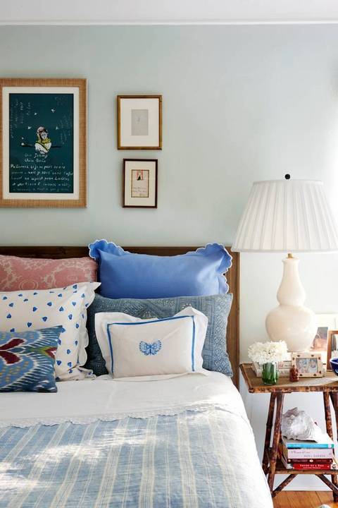

Ahh…the bedroom.  Blues and pinks.  Love it all!   So many things to study and to look at.  Do you remember her NY apartment published in Vogue?  See below.  This is how her bedroom looked back then.


And, here is more of now.


Raoul's blue and white Kashmir delft gets me all the time!  How wonderful does it look on that little tufted settee and in her bedroom!  And, the pink shaded sconce?   I remember that settee in her NY apartment which was in her living room.  See below.  


It's always fun to see how designers re-purpose their furnishings.  The settee looks great in both settings.


If you're interested in seeing her NY apartment in Vogue, go here.  It's always fun to see how her style has evolved and how she switched things around!  

Tuesday, December 15, 2015

E- Design: A Stylish Entry for a Starter Home

A couple of months ago, a reader contacted me who wanted help with her entry.  She recently got married and she and her husband just bought their first home in Connecticut.

Like many starter homes, space is limited and trying to make a good first impression in a very small entryway can be challenging.  Fortunately, when space is limited, it allows you to stretch your budget because the number of items needed is less.

It was important to this young and stylish reader, that there be some sort of table to house keys, mail and a pretty lamp.  To accomplish this, I picked a demilune table that is perfect for small spaces.  It provides a usable surface, but it's shallow enough to be tucked away.


My reader also wanted the space to be chic, feminine, but also sophisticated.  She loves hints of colors especially pastels.  I knew a decorative rug was key to infusing the color she wanted and a vintage rug fit the bill.  The scalloped flush mount, mirror and table all play to the feminine side while the gray paint and ceramic lamp keep it sophisticated and grounded.  

So, there you have it!!  She loves it and can't wait to start implementing it.  If you need help designing a room, please feel free to contact me

Tuesday, October 27, 2015

Helping a Client Select Fabrics

I recently helped a client decide which fabrics to use where in her soon to be baby's nursery.  She already had the fabrics selected, but needed help putting it all together.  We discussed what fabrics would look good as window panels, crib bedding, pillows and on upholstered furniture. She was particularly on the fence with whether to do solid fabric with trim or a fun print as the window panels.  I suggested the fun print as I think it can really make a fun statement!

If your budget is flexible, I think picking a fun print as window panels can make all the difference.


Above is NOT the design of my client, but rather an example I created using a fun print as panels.  I have always wanted to use Katie Leede's 'Thebes' fabric!

If you need help designing a room, please feel free to contact 'me'!


Thursday, November 20, 2014

Green Street Loves...

First, thank you all for your very thoughtful and kind comments regarding my little girl's room.  I was so touched! :)

So, what else have I been loving lately besides E's room??

Lately, I have been inspired by all things green, aqua, gold, fresh and bright.  It's gotta be this cold front we are experiencing, because why else would I be pinning furnishings and fabrics in aqua tones??


Could it be I am already yearning for warmer weather and we haven't even hit winter yet??  Boy, I'm in trouble.  How about you?


Tuesday, February 4, 2014

Porthole Mirror

I am happy to report that I am alive and well after an on-slought of illnesses in our home (that lasted about 10 days).  When it rains it pours - stomach viruses, sinus infections, etc.

Luckily, neither my husband or I got the stomach virus and we were able to celebrate his birthday this past weekend.  We went to Edward Lee's restaurant 610 Magnolia!  I highly recommend it if you've never been or are visiting the area!

So, lately, I really like porthole mirrors.  Kinda of a strange thing to fixate on....but,  if I had a a waterfront  home in New England, I would fully embrace it!  


I love the above vignette from Hudson Interiors.  If you like porthole mirrors, you could pick up this one (pictured below) from Target to create a similar look.


Since I might get a lot of questions as to why there is a porthole mirror in our entry (being that we live in Louisville and well, water is nowhere in sight), I might settle for something a little less obvious, but that has a similar feel.

I really like the mirror pictured below (of course, all the blue and white porcelain helps too!).

It has a similar porthole look and I like the black frame.  I recently picked up this mirror from Target (see below) and I have to tell you I really, really like it.  In fact, I like it so much, I went back and purchased another one.  Thinking of painting it and using it in my daughter's room.  


The frame is slightly distressed and I like how it sits deeply into the frame making it feel more like a porthole.  This black mirror works nicely in our entry against our white walls and I like how the round shape breaks up all the lines from our entryway walls and console.  So, if you're on the hunt for a great round mirror - this might do the trick!  I hope to have pictures of our entry soon!