Showing posts with label Designer. Show all posts

Friday, January 6, 2017

New Traditional

What better way to get inspired for the new year than by a new project designed by Studio McGee? This is (by far) my favorite project they've showcased.  I like to call it the 'new traditional'.  


In a square room like this one, a round table is a smart design choice.  Helps make the room easy to navigate.  


Mixing in modern elements, like this lamp, helps keep the room feeling young and fresh.   Like the lamp, but not the price tag?  

Here is a similar one half the cost.  


The dining room is a show stopper, no?  The Hollyhock wallpaper!  I'm in love.   The mix of the light wood furnishings with the dark wood stained floors helps keep the room feeling fresh and airy.  

Like floor color?  Mix one half Ebony and one half Jacobean from Minwax to achieve a similar wood stain.


Such good flow. 


If you are like me and love everything about the look of this project, don't hesitate to contact me and I'll help you create this look for your home!!  And, if you love the dining room wallpaper, it was meant to be, because we are then soul sisters! ;)

Tuesday, May 3, 2016

Visiting Draper James

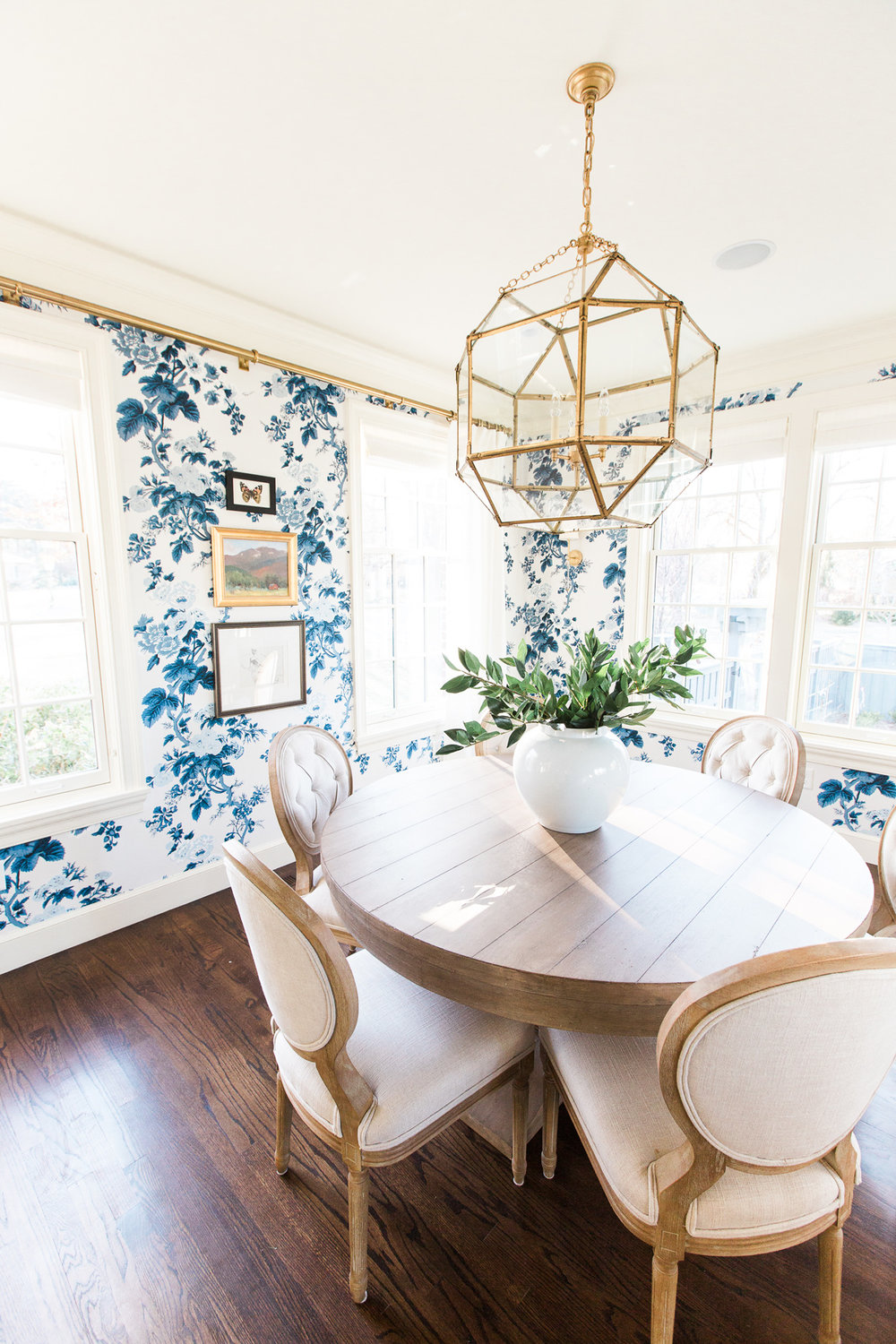
My husband and I escaped for a one night getaway to Nashville this past weekend and it was exactly what we needed (other than more of it, but I will take what I can get)!  It took a combination of friends and neighbors to watch my little ones at home, but I guess that is what they call, 'parent life', huh?

Nashville was great!!  First time there and I absolutely LOVED it.  The beautifully manicured residential areas with pea gravel driveways, the cool/hip stores on 12th Ave South, the pedestrian shopping areas, Franklin's downtown, Leiper's Fork, and it's very down to earth, southern hospitality and friendliness.  It all was so good.

Of course, I visited Reese Witherspoon's flagship store, Draper James.  I love Mark D. Sikes, interior designer who designed the store, and his use of all things blue and white!!

It was so MUCH better in person and I truly was inspired.  I  'geek-ed' out ALL over this store and it wasn't until I came home that it struck me why the interiors of this store really left an impression on me.

It had every element of design that I love (and I mean really, really love when creating a home).  It was one of those Oprah 'A-Ha' moments where you get to experience everything you love in one space.

The store is designed much like a home which is such a brilliant idea and concept.  When you walk in you're greeted with a large table similar to a large round pedestal table in a foyer and a beautiful plaster chandelier that hung in the store's entry.

I am obsessed with the store's lighting choices and this chandelier had a Stray Dog Design feel, but I don't believe it is from them.  It was large, beautiful and made a statement.  And, I LOVED that it was whimsical.  It seriously was the last thing I expected as one of the design elements in this southern store and it was so perfect (in my humble opinion).


Next, your eyes are immediately drawn to the back wall where dark navy grasscloth hangs showcasing gorgeous artwork and serves as a backdrop to the store's countertops which are meant to mimic a kitchen island.  And, yes, the counters are thick slabs of marble!! 


Here, the built-ins are meant to mimic kitchen cabinetry or a butler's pantry.  I adore the antique brass utility latches on the glass fronts (I recently recommended this style of hardware to one of my clients) and the style of brass hardware pulls used for the drawers.  The combination of white and gold really speaks to my love for things a bit feminine, but the brass keeps things grounded which is classic and timeless.  The library boston sconce installed above the built-in cabinetry ties in the gold and white and looks brilliant next to navy. 


Pictured above are the modern counter stools pulled up to the store's countertop.  Another element I love is the bit of California thrown into an otherwise traditional, classic and all-American mix!  


This beautiful brass and navy lantern hanging near the vibrant blue whicker chairs imitate the 'family' or living room.  


Pictured above is the 'family room' and I love how Serena and Lily's blue tonal striped dhurrie is layered over a natural fiber rug coupled with the blue Bielecky Brothers wicker lounge chairs. The chairs were SO comfortable!!


I saw dentil molding, vertically planked walls and beadboard.  Above, an example of the store's full length mirror encased in beautiful molding!  The store's walls were either pristine white backdrops or wallpapered in either beautiful paper or fabric, as shown below.  


Above is Quadrille's Palampore Stripe fabric draped on the walls with navy grosgrain trim.  Beautiful!!


Above was another favorite spot of mine. It did the perfect job of resembling a kitchen nook.  Obsessed with everything about this space.  I love Carolina Irving's Palermo (whimsical) print and Patmos Stripe on the banquette.  All these fabrics work beautifully together!  


A close-up of the gorgeous textiles with the beautiful navy and brass sconce!!  LOVE!  


The store's fitting rooms - gasp - obviously, resembling a home's bedroom and/or closet area.  I am dying to use Farrow and Ball's closet striped wallpaper in someone's home!!  Again, dark navy doors with brass fixtures!! Here, we see a repeated design element of stripes.  


I love the play of vertical and horizontal stripes in the same space!! So fun!  And, the closet hooks!!  I need these!  I found a similar type here, but not in the brass finish.   


I've used the sconce's shade fabric in a client's project before and I love it!!  Perfect for a fabric covered lampshade.  

The color scheme was definitely blue and white, but I love how Mark Sikes threw in 'yellow' to keep things fresh, young and modern.  He has such an amazing eye and love all his touches of playfulness.


I will have to save the artwork for another post - it definitely was a highlight of the store as well as, the store's bathroom, believe it or not!! 

Visiting this store did not disappoint and it confirmed all the things I love and would like to emulate in my own home.  It gave me loads of inspiration and perhaps the little shove I need to finally finish some projects. 

Case in point, I immediately purchased this rug to go in my kitchen nook! :)

Tuesday, November 17, 2015

Thank you and A Beautiful (Renovated) Cottage

I just want to say 'THANK YOU' for stopping by to see my One Room Challenge and leaving such incredible comments!! I felt the love you guys - thank you so much!!  It truly was icing on the cake after having worked so hard on it and not knowing how it would be received.  I would be lying if I didn't say that I had a nervous stomach for most of the day!

Today, I thought I'd leave you with some pretty pictures found on StyleBlueprint of this beautifully renovated cottage designed by Julie Couch.

This home is a great testimony on how to maximize the most of your natural light when you have a small home!  I'll let the pictures by Alyssa Rosenheck Photography speak for themselves.


To see more of this beautiful home designed by Julie Couch, go here.  Have a good week!

Monday, September 21, 2015

A New Take on a Family's Napa Home

Back in 2014, Style Me Pretty, posted a beautiful home tour designed by Irene Lovett from Designstiles.  You can see the full home tour here.  But, fast forward to today and it seems like the same home got some pretty fantastic updates.

Both Rue Magazine and Domaine have published the same home tour (with the new updates) and I thought it would be fun to note the differences.

This is the family's dining room shown in 2014 on Style Me Pretty.


I love the antique rug and how clean and fresh this room looks.  And, below is the dining room as seen now on Domaine.


It is always interesting to note what has remained or changed.  I love the softer palette.  Just beautiful.  They obviously kept the furniture, but installed wall to wall carpeting, layered with a new antique rug.  They also installed a new light fixture and changed out the mirror.  It seems like the 'old' dining room mirror got relocated to the bathroom.  See below.


Looks wonderful here!  Another room that received an update is the powder room pictured below (this picture was shown on Style Me Pretty).


This room is so different now.  Here it is (below) now on Domaine.


Can we just say brilliant!!  In my opinion, the paneling and grasscloth make this powder room (and the floor tiles aren't bad either) ;) I love how they used the Serena and Lily's mirror (which I would love to use either in my own home or in someone else's home.)

Here is a picture of the home's kitchen on Style Me Pretty back in 2014.


It appears that the kitchen got a pretty significant renovation.  There isn't a window anymore above the stove, the fridge got relocated, they installed brass hardware, changed out the island pendants and installed a new island.  Here is the kitchen now on Domaine.


They relocated the Hicks pendant to the kitchen nook and I love, love the blue island.  So, which do you like better?  Anything you see that you absolutely love?  To see more of this Irene Lovett's portfolio, go here.  You won't be disappointed!

Thursday, August 27, 2015

Lauren McGrath's Upper East Side Apartment

You can tell I've been blogging for a long time, when I remember when Lauren McGrath's first apartment was published in Traditional Home.  Any of you remember that?  It was one of my favorites.

Fast forward to today, she is now living on the Upper East Side in a pre-war one bedroom apartment with her boyfriend, a celebrity hairstylist.  I like McGrath's style.  What appealed to me the most was how comfortable and cozy her apartment feels.  This comes from the traditionally upholstered english-esque type furnishings.  The florals, animal print and ikats warm up the white walls while the contemporary art creates great contrast - I love the mix!


How beautiful are those upholstered slipper chairs?  I'm sure they are Billy Baldwin.  And, the club chair upholstered in Quadrille's Jardin Des Plantes, so beautiful!


I'm seeing more and more of where the seat of the sofa is upholstered in a different fabric.  If you follow William McClure on instagram, he recently did that to his sofa and it looks great.


And, the above space is just perfect!  So soft and feminine.  I love the bamboo desk as a bedside table with the bentwood chair.   The dark chair grounds the otherwise light and airy space.

If you want to see the full article, go here.

Monday, August 24, 2015

A Fresh Perspective

I am drawn to interiors that are classically designed but are infused with a fresh perspective.  By that I mean rooms that have traditional design but are layered with modern elements.  Great things can happen when you carefully mix traditional and current elements.


Take for example, this beautiful bedroom designed by Henry & Co. Design (Elle Clymer and Stephanie Woodmansee), one of Traditional Home's 2015 rising stars of design.  

I have always loved the classic Colefax and Fowler's Bowood chintz fabric seen here on the upholstered headboard.  I actually plan to use this fabric as an accent fabric in our master bedroom.  It is such a classic and here, it is beautifully paired with the Chelsea Textiles streamlined bedside table.  A perfect example of classic and current elements carefully mixed.  


A beautiful blue Christopher Spitzmiller lamp sits on top of what looks like Ikea's malm dresser.  And, I love the custom banding on the pretty quadrille roman shades!  I think panels would have made this room too fussy - roman shades gives it a casual yet sophisticated feel, that is also practical.  

Thursday, June 4, 2015

A Martha Vineyard's Home

There are so many elements I love about this home.  The nautical touches, the subdued, but fun use of color and pattern and all the classical elements running throughout the home.  


I love how colonial this dining room feels.  The above room was the inspiration for my dining room; see our dining room progress here.  


Is that Katie Ridder's Peony pattern in a rug? (above).  I've never seen it as a rug before.  


This home has all my favorites - striped walls, painted floors, spindles, empire lamp shades, gold framed nautical oil paintings, Katie Ridder fabrics, blue and green colors, antique furnishings and colonial touches.  To see more of this home designed by Molly Luetkemeyer (m. design interiors), go here.