Showing posts with label Hallway. Show all posts

Monday, October 15, 2012

A Passageway & A One Off Piece

The amount of space we have for our so called mudroom is what I would classify as a passageway. A small space that juts off the entry with a door to go down to our basement.  The space is no more than 2 feet deep and 4 feet wide.

This space will have to serve as the 'so-called' mudroom - a place to hang your coats and take off your shoes when you come in from the outside.  Luckily, we also have two hall closets by the powder room which can house coats and jackets not used on a daily basis.  This space is priority right now because currently everyone drops their jackets and shoes on the kitchen floor when they come in from the outside and it is driving me nuts!

Since this space is just a passageway, many of the below photos are my inspiration.


A passageway is just enough space for some type of coat/hat rack on the wall.


Hopefully, I can find a small bench to work in the space too! 


Have you noticed (in the above photos) that all the hooks used are some type of one of a kind coat/hat rack?  Mostly, vintage.  I love that!  I've been scouring ebay and etsy for some one-off pieces.  There is so much out there you guys!  It has been really fun.  I need to make a decision fast, though, because it won't be long until we also have hats, mittens and boots to add to the mix!  Wish me luck!  


Thursday, March 8, 2012

Katie Rosenfeld Design

It is always fun to find a new designer or blog that you find inspirational.  As a fellow New Englander, I was very excited to find Katie Rosenfeld Design via her blog Bogle Street.  


Bogle Street, which I spent over an hour reading, is packed full of useful design information, expertise and tips.  On top of that, her designs are so inspirational.  They are classically inspired, but full of punch with colors and patterns.  I've posted a few of my favorite images above and below.  


Make sure you take a moment to check out her blog and portfolio.  You won't be disappointed!  

Monday, November 14, 2011

A Splash of Pink

I'm not sure it is because I have a little girl, but I'm falling head over heels for interiors with a splash of pink.  At first, I was convinced a pink sofa would be the right amount of pink to make me super happy!


But, after living with a pink sofa in our rental, I can tell you it is not ideal with little kids.  It takes only seconds for my son to finish his lunch and then go dive on the pink sofa with his greasy hands.  Hello stains!  So, I'm reconsidering a pink sofa (unless it is in our master bedroom, but I need to convince my husband of that!) and am now thinking of injecting a splash pink in other ways.


Hello pink chair!

Wednesday, July 20, 2011

Before & After: Our Upstairs Hallway

It's been forever since I last reported on our upstairs hallway.   I finally completed it.  If you remember (don't worry if you don't because it has been forever), we painted horizontal stripes on the walls.  I loved them, but found it difficult to decorate such a small space with bold walls.  My goal was to brighten the room and I was dead set on having a mirror in the hallway.  We lived with one for a long time, but I wasn't thrilled with it.  I finally ditched the idea and went the graphic route.  I love how it turned out.

After:


After:


Before:


Before:


Even though this took a long time, I have to say I took my time sourcing/finding the items for this hallway.  

Rug: Ikea Erslev
Ceiling fixture: Lowes (This makes the space.  It took me forever to find a stylish flush mount for our v. low ceilings)
Table lamp: Ikea Marby
Tray: West Elm
Poster: Super Rural
Book: Reader's Digest $9 (for a set of 3)
Table: Garage Sale $20
Lamp Shade: Garage Sale $5
Flowers: Gladiolus $5
Artichoke: Garage Sale $2

So, what do you think?  A big improvement in my opinion.  

Wednesday, July 13, 2011

Another All Time Favorite & Hable Construction Discount


During our 12 hour road trip to Michigan (and back) I brought all of my domino magazines and looked through each and every one of them.  It was so great revisiting these magazines and getting so inspired all over again! While browsing through the issues, I came across Rita Konig's apartment (an oldie but goodie) and realized how much I really love it.


I love her style and the infustion of english design in her apartment.  It really appeals to me.  In her new apartment (not pictured) she has balloon shades which I really like.  It brings back memories living in Belguim growing up.


She's really good at creating that slightly messy piled on British look. 

Her designs scream comfort and I'd like to create more of that look in my home.


So femnine and cozy.  If you notice under her console table there are two hable construction totes which she uses for storage.  I love this idea.  I've been in love with Hable Construction for a long time, but have held off in investing in a couple of pieces because of price.  Well, they are having a sale on their storage bushels. 


Go here!!

Friday, September 10, 2010

Decisions, Decisions...

I am slowly working on our upstairs hallway (landing) and am trying to find the 'rug' that is going is going to make shout, "That's it!".  I can't blame you if you have forgotten and are asking, "What hallway is she talking about?".   Remember?
I recently ordered this beauty from Rugsusa.  
I wanted to add yellow to the space because the upstairs hallway/landing leads directly into our bathroom.  If the bathroom door is open, you will have direct view of the window coming up the stairs and I'm using this fabric for a fixed roman shade.
I like the yellow with the blue against an otherwise all neutral (beige, brown & white) backdrop.  I wasn't too impressed with the rug. The yellow isn't a bright yellow (like the picture); it's more a mustard yellow. For $145, it left me saying "ho-hum" and the hand woven material wasn't cutting it for me.  So, back to the drawing board.

Here are some other options I'm considering.  I'm now thinking more of a neutral color for the rug and will incorporate the yellow via accessories.  
A:
Think the light blue would complement the navy blue in the roman shade fabric.  
B:
C:
Love the pattern below.  It is very similar to the tile pattern we will have on our bathroom floor (Daltile's 2" hexagon). 
D:
Love the faux bois - such a great neutral. 
E:
I brought home a sample of Dash Albert's circle fret rug and loved it!! It is just pricey.  
F:
So, what are your thoughts? Any favorites? Should I try other colors?  Do I seem desperate for help??  Well, I am!! :)  
Have a great weekend everyone!!  And, thanks again for all your help!!

Monday, August 9, 2010

Hallway - Horizontal Stripes (Part 2)

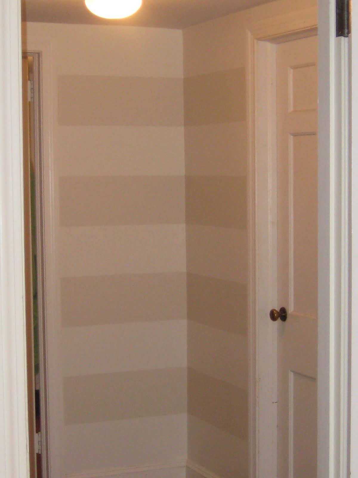
Last weekend, I painted the upstairs hallway walls Benjamin Moore's Cloud Cover (satin finish) and while it was a huge improvement, I felt like it needed more.  I have been wanting to try some type of stencil or stripes on the wall for a while now.  And, recently, I was re-inspired by Emily's post and I thought, 'Why not?'  So, I decided to do subtle tone on tone horizontal stripes.  Subtle was the emphasis here and I decided to paint the stripe one shade away from the wall color called Benjamin Moore's Winds Breath (eggshell finish).


Hallway before:


And, hallway after:


Hallway before:

Hallway after:
A lot still needs to be done, but I was thrilled with how the stripes turned out so I decided to post it now.  Two tutorials I followed pretty closely were Young House Love and Emily Clark's.


Our hallway (more like an upstairs landing) has a lot of corners, so when marking the walls with the painter's tape, it was important to keep it straight and level.  My husband helped me and we used a "L" square and a level to insure the markings were straight.  

I also decided to have the lighter color as the first stripe and I believe it made a difference and kept the landing feeling lighter and brighter.

Note: Mr. Zebra (from my last post) was intended as a hint, not a red-herring.  I'm going to have to get better at leaving hints! :)

Wednesday, July 14, 2010

Lighten up the hallway (Part I)

So, our upstairs hallway is as dark and dim as they come.  No natural light.  The hallway leads into 3 separate rooms (an upstairs bathroom and 2 bedrooms).  It is only when the doors to the adjacent rooms are open does the hallway get any natural light.  So, I've been researching a bit on how to brighten this shoebox up (literally, our hallway is the size of a shoebox). 
First and foremost, paint.   Paint is the easiest and cheapest way to transform a room with the most impact.  So, this post (part I) will focus on choosing a paint color to help lighten up a dark space.  To help me with this daunting task (daunting for me because the possibilities are endless), I pulled out my trusty guide: HB 500+ Favorite Paint Colors.
I jotted down some of my favorites, but also knew I had to consider a couple of givens.  The staircase leading up to the hallway is painted Benjamin Moore Revere Pewter (above picture).  Love it.  That same color is in our living/family room which receives the most light in the house and this grayish color with taupe undertones is the best neutral out there.  It's the perfect mix of cool and warm.  I can't use this color in the hallway because it would look too dark - it's amazing how the same color can look so different in another room all because of the lighting.  So, I need a bright color that reflects light.  Since I know I will have a cabinet in the hallway that I want to paint this color... 
Benjamin Moore Galapagos Turquoise....for no other reason other than I love this color and saw it used here , I need a wall color that would at least complement this color.  I initially went down the road of light/sky blues; for example, Benjamin Moore's Ice Blue and Icing on the Cake.  Both are beautiful colors.  They are bright and went well the paint color for the cabinet, but unfortunately (in my opinion) they didn't transition well from the Revere Pewter coming up the staircase.  So, I finally decided on Benjamin Moore's Cloud Cover.
A lighter and brighter version of Revere Pewter and a bit warmer.  I'm considering painting it semigloss finish with the hope that it will reflect even more light??  Thoughts on this??  Painting will occur this weekend so I hope to have before and after pictures soon.  Also, stay tuned for part II when I show how I am going to add accessories to help brighten my space up!