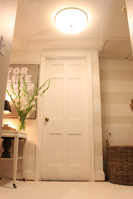
It's been forever since I last reported on our upstairs
hallway. I finally completed it. If you remember (don't worry if you don't because it has been forever), we painted
horizontal stripes on the walls. I loved them, but found it difficult to decorate such a small space with bold walls. My goal was to brighten the room and I was dead set on having a mirror in the hallway. We lived with one for a long time, but I wasn't thrilled with it. I finally ditched the idea and went the graphic route. I love how it turned out.
After:
After:
Before:
Before:
Even though this took a long time, I have to say I took my time sourcing/finding the items for this hallway.
Ceiling fixture: Lowes (This makes the space. It took me forever to find a stylish flush mount for our v. low ceilings) Table: Garage Sale $20
Lamp Shade: Garage Sale $5
Flowers: Gladiolus $5
Artichoke: Garage Sale $2
So, what do you think? A big improvement in my opinion.


Your hallway looks amazing Fran! I love every detail and really think that using graphic art in this space was genius.
ReplyDeleteThanks for linking to my store too :)
Looks great Fran! I love that poster and I have not found a stripe that I don't like yet:)
ReplyDeleteIt's such a great transformation, Fran! You've taken a space that's typically forgotten and made it really special. And don't even get me started on your tag sale table...I love it's little castered feet!
ReplyDeleteIt's really something... you did a great job putting it all together. It's such an unexpected treat to get to the top of the stairs and have that lovely landing to look forward to. Well done, Fran!
ReplyDelete-ME xo
Beautiful job Fran, you can never go wrong with bold stripes, but you did an amazing job tying everything together...love the graphic wall art you chose for the space.
ReplyDeleteWow, Fran! HUGE improvement! I love the shape of the black lampshade and how you put everything in a tray. The stripes look great too. I bet that took forever!!
ReplyDeleteCamille
Love your hallway! It is a huge improvement and you did a fantastic job outfitting a small space with a lot of personality. I keep thinking about getting one of those "Like Forever" posters for my daughter's room - they're so cute.
ReplyDeleteIt looks fantastic!!! I love that print so much. The oversized scale of it in small space makes it so dramatic! Great job.
ReplyDeleteHoly cow! It looks like it belongs in a shelter mag! I absolutely love the transformation. You've also reminded me to pay more attention to those "forgotten" areas in our house. Details do matter!
ReplyDeleteFran, it looks awesome! Very big impact with the striped walls and the poster. Agree with Carrie--that little vignette could totally be in a shelter mag--and should be!
ReplyDeleteAlways love a budget space that doesn't look budget. The tray is my favorite part.
ReplyDeleteThis is wonderful. I saw your blog at The Mustard Ceiling and am a new follower. I looked and looked for a "stylish" flush mount fixture too. Mine is still the rounded style but a big improvement over my previous light! Oh and the flowers are spectacular. Have a good week!
ReplyDeleteWow- looks gorgeous! I really love that poster! It all came together beautifully. :)
ReplyDeleteFirst off, looks amazing! Second off, I'm obsessed with that kitchen. Just found you from Mustard Ceiling, and I'm your latest and greatest follower ;)
ReplyDeleteP.S. I'm a CT blogger too :D
ReplyDeleteI also found you through Elizabeth at The Mustard Ceiling (although I believe I've visited you before). I LOVE what you did in your hallway. It looks great - and those flowers are so beautiful.
ReplyDeleteOh wow! I never knew a little hallway could look so good! And gladiolas are my absolute favorite. :)
ReplyDeleteFor, like, awesome.
ReplyDeletelove this! it reminds me of something i would have seen in ashley putman's house. i know you love that home as much as i do. well done!! xo, tessa
ReplyDeletelooks fabulous! I really love your stripes.
ReplyDeleteThank you for sharing this post. I actually love how you arranged every element in this hallway. The painting is amazing, that wall art is really working pretty well and the table lamp is so cool! This will surely encourage others to do some home makeovers of their own. Again, thank you for this post.
ReplyDeleteLiaison: seo specialists liaise with many different parties, hence, they must lead from front because of their
ReplyDeletebusiness to online to increase their sales and services.
My blog post; search engine optimization rank